1. Scenarios
A gradient circular progress bar needs to be implemented, looking like this:
[caption id="attachment_1238" align="alignnone" width="200"]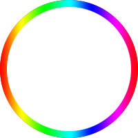 circle[/caption]
At 0 progress, it displays a gray track; during the loading process, the colored bar completes a full circle clockwise.
2. The Classic "Two Doors" Solution
There is a classic solution for circular progress bars, the principle of which is very interesting. The HTML structure is as follows:
<div class="circle progress-basic">
    <div class="left">
        <div class="circle left-circle"></div>
    </div>
    <div class="right">
        <div class=" circle right-circle"></div>
    </div>
</div>
Ignoring the circle for a moment, imagine a double door: progress-basic is the door frame, left is the left door leaf, and right is the right door leaf, as shown below:
.progress-basic {
    position: relative;
}
.left, .right {
    position: absolute;
    width: 100px; height: 200px;
    top: 0;
    overflow: hidden;
}
.left {
    left: 0;
}
.right {
    right: 0;
}
Now consider how to achieve the 0-180deg effect: the progress bar needs to appear gradually from the 12 o'clock position, filling the right semi-circle. At 180deg, the left semi-circle is a gray track, and the right semi-circle is filled with the progress bar.
Imagine a square piece of paper with a semi-circle drawn on the left side. Cover the left side with your left hand, then rotate the paper clockwise. The semi-circle will gradually appear from under your left fingertips. When you have rotated it 180 degrees, the left side is blank and the right side is the semi-circle. You cannot rotate it further, or the illusion will be broken (the semi-circle progress bar has just finished its path; further rotation would disconnect it).
The method for 180-360deg is similar: hide the semi-circle progress bar first, then rotate it out bit by bit. The complete CSS is as follows:
.circle {
    width: 200px; height: 200px;
    box-sizing: border-box;
    border-radius: 50%;
    border: 10px solid silver;
}

.progress-basic {
    position: relative;
}
.left, .right {
    position: absolute;
    width: 100px; height: 200px;
    /*塞进父级border*/
    top: -10px;
    overflow: hidden;
}
.left {
    /*塞进父级border*/
    left: -10px;
}
.right {
    /*塞进父级border*/
    right: -10px;
}
.left-circle, .right-circle {
    border-color: #077df8;
}
.left-circle {
    margin-right: -100px;
    border-left-color: transparent;
    border-top-color: transparent;
    transform: rotateZ(-45deg);
}
.right-circle {
    margin-left: -100px;
    border-right-color: transparent;
    border-bottom-color: transparent;
    transform: rotateZ(-45deg);
}
The door frame provides its own gray track, the two doors use overflow: hidden, the left door leaf hides the right semi-circle progress bar, and the right door leaf hides the left semi-circle progress bar. Rotate the right paper first, and the semi-circle on the left side of the paper appears bit by bit. After reaching 180 degrees, rotate the left paper, and the semi-circle on the right side of the paper appears bit by bit. At 360 degrees, they precisely stitch together into a complete circle. As follows:
var $ = document.querySelector.bind(document);

void function() {
    var $rightCircle = $('.right-circle');
    var $leftCircle = $('.left-circle');
    var prog = 0;
    var deg = 0;
    var initialDeg = -45;
    var halfDone;
    var timer = setInterval(function() {
        prog += 0.01;
        deg = 360 * prog;
        if (deg < 180) {
            $rightCircle.style.transform = 'rotateZ(' + (initialDeg + deg) + 'deg)';
        }
        else if (deg < 360) {
            if (!halfDone) {
                console.log('half done');
                $rightCircle.style.transform = 'rotateZ(' + (initialDeg + 180) + 'deg)';
                halfDone = true;
            }
            $leftCircle.style.transform = 'rotateZ(' + (initialDeg + deg - 180) + 'deg)';
        }
        else {
            console.log('done');
            $leftCircle.style.transform = 'rotateZ(' + (initialDeg + 180) + 'deg)';
            clearInterval(timer);
        }
    }, 100);
}();
This is a very clever method. I'm not sure if it has a formal name, so let's call it "Two Doors" for now.
P.S. This can also be achieved through clip, with the same principle.
3. Attempting the Classic Solution
The "Two Doors" principle seems universal. When applied to a gradient progress bar, the progress bar image needs to be flipped horizontally and then divided into left and right halves, as shown in the figure:
[caption id="attachment_1239" align="alignnone" width="404"]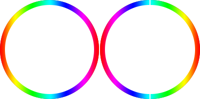 circle-left-right[/caption]
Specifically as follows:
<div class="circle circle-image progress-basic">
    <div class="left">
        <div class="circle left-circle"></div>
    </div>
    <div class="right">
        <div class=" circle right-circle"></div>
    </div>
</div>

/*用渐变图片左右拼*/
.circle-image .left-circle {
    margin-right: -100px;
    border: none;
    background: url(circle-right.png) no-repeat 100px 0;
    -webkit-background-size: 100px 200px;
    background-size: 100px 200px;
    transform: rotateZ(0deg);
}
.circle-image .right-circle {
    margin-left: -100px;
    border: none;
    background: url(circle-left.png) no-repeat 0 0;
    -webkit-background-size: 100px 200px;
    background-size: 100px 200px;
    transform: rotateZ(0deg);
}
There is a fatal problem: the two halves do not connect at 180 degrees. In a solid-color scenario, the left and right semi-circles are the same color, so the difference between 180-360deg is invisible and connection is not an issue. However, with a gradient circle, it is very obvious that after 180 degrees, the left circle appears by rotating as a whole, rather than appearing bit by bit. The attempt failed; consider other methods.
4. White Block Mask
Another different approach is to lay the progress bar circle underneath first, masking both sides with white blocks. Then, rotate the right white block clockwise so that the underlying right semi-circle gradually appears. At 180 degrees, switch to rotating the left white block so the underlying left semi-circle gradually appears.
This avoids the connection problem because the circle is already complete. Having solved the bar problem, we also need to consider the track. The track can be drawn on the left and right white blocks; as the blocks rotate, the track follows, and the progress bar appears bit by bit. Perfect. Specifically as follows:
<div class="circle circle-block progress-basic">
    <div class="left">
        <div class="block left-block">
            <div class="circle"></div>
        </div>
    </div>
    <div class="right">
        <div class="block right-block">
            <div class="circle"></div>
        </div>
    </div>
    <div class="circleBar"></div>
</div>

/*用白块遮住*/
.circle-block .block {
    width: 100%; height: 100%;
    background: #fff;
}
.circle-block .right-block {
    -webkit-transform-origin: 0 50%;
    /*盖住露出的边缘*/
    border-right: 1px solid #fff;
}
.right-block .circle {
    margin-left: -100px;
    border-left-color: transparent;
    border-top-color: transparent;
    transform: rotateZ(-45deg);
}
.circle-block .left-block {
    -webkit-transform-origin: 100% 50%;
    /*盖住露出的边缘*/
    border-left: 1px solid #fff;
    margin-left: -1px;
}
.left-block .circle {
    border-right-color: transparent;
    border-bottom-color: transparent;
    transform: rotateZ(-45deg);
}
.circle-block .circleBar {
    width: 200px; height: 200px;
    margin-top: -10px; margin-left: -10px;
    background: url(circle.png) no-repeat 0 0;
    -webkit-background-size: 200px 200px;
    background-size: 200px 200px;
}
On high-resolution devices, the white block mask isn't perfect, so the following is needed:
/*盖住露出的边缘*/
border-right: 1px solid #fff;
The result is decent, but there is an obvious limitation: it only works on solid-color backgrounds because the background color of the white blocks must match the page background color; otherwise, the illusion is broken.
5. Canvas Stroke
If conditions allow, you can use Canvas to draw it, and all problems are solved:
<canvas class="canvas">Canvas not supported</canvas>

void function() {
    var options = {
        size: 200,
        lineWidth: 10,
        rotate: 0
    };

    var canvas = $('.canvas');
    var ctx = canvas.getContext('2d');
    canvas.width = canvas.height = options.size;

    // 重置原点到中心点
    ctx.translate(options.size / 2, options.size / 2);
    // 旋转-90度,让x轴与-y方向重合
    ctx.rotate((-1 / 2 + options.rotate / 180) * Math.PI);

    var radius = (options.size - options.lineWidth) / 2;

    var drawCircle = function(color, lineWidth, percent) {
            percent = Math.min(Math.max(0, percent || 1), 1);
            ctx.beginPath();
            ctx.arc(0, 0, radius, 0, Math.PI * 2 * percent, false);
            ctx.strokeStyle = color;
            // butt, round or square
            // 线条两端的形状
            // butt 默认,两端不加装饰,截断感
            // round 给线条两端包上半圆
            // square 给线条两端包上半方,看起来和butt一样,但比butt长一个lineWidth
            ctx.lineCap = 'butt';
            ctx.lineWidth = lineWidth;
            ctx.stroke();
    };

    // 灰槽
    drawCircle('#efefef', options.lineWidth, 100 / 100);

    var prog = 0;
    // 色条渐变
    var gradient = ctx.createLinearGradient(0, 100, 0, -100);
    gradient.addColorStop(0, '#ff0000');
    gradient.addColorStop(0.15, '#ff00ff');
    gradient.addColorStop(0.33, '#0000ff');
    gradient.addColorStop(0.49, '#00ffff');
    gradient.addColorStop(0.67, '#00ff00');
    gradient.addColorStop(0.84, '#ffff00');
    gradient.addColorStop(1, '#ff0000');
    // '#077df8'
    var timer = setInterval(function() {
        prog += 1;
        // 色条
        drawCircle(gradient, options.lineWidth, prog / 100);
        if (prog >= 360) {
            clearInterval(timer);
        }
    }, 100);
}();
Note the definition of the gradient:
var gradient = ctx.createLinearGradient(0, 100, 0, -100);
This actually defines a linear gradient from right to left, because the coordinate system underwent two transformations:
// 重置原点到中心点
// 原点平移到(100, 100)
ctx.translate(options.size / 2, options.size / 2);
// 旋转-90度,让x轴与-y方向重合
// x轴y轴转置
ctx.rotate((-1 / 2 + options.rotate / 180) * Math.PI);
It is easy to give the progress bar rounded ends:
ctx.lineCap = 'round';
// 线条两端的形状
// butt 默认,两端不加装饰,截断感
// round 给线条两端包上半圆
// square 给线条两端包上半方,看起来和butt一样,但比butt长一个lineWidth
However, Canvas strokes suffer from aliasing on high-resolution devices, requiring a little trick:
var width = canvas.width, height=canvas.height;
if (window.devicePixelRatio) {
    canvas.style.width = width + "px";
    canvas.style.height = height + "px";
    canvas.height = height * window.devicePixelRatio;
    canvas.width = width * window.devicePixelRatio;
    ctx.scale(window.devicePixelRatio, window.devicePixelRatio);
}
Scale the image according to the screen ratio to solve the aliasing problem.
6. SVG Stroke Animation
Similarly, if conditions allow, you can also use SVG stroke animation, as follows:
<div class="progress-svg">
    <!-- 条 -->
    <svg viewBox="-10 -10 220 220">
    <g fill="none" stroke-width="10" transform="translate(100,100)">
    <path d="M 0,-100 A 100,100 0 0,1 86.6,-50" stroke="url(#cl1)"/>
    <path d="M 86.6,-50 A 100,100 0 0,1 86.6,50" stroke="url(#cl2)"/>
    <path d="M 86.6,50 A 100,100 0 0,1 0,100" stroke="url(#cl3)"/>
    <path d="M 0,100 A 100,100 0 0,1 -86.6,50" stroke="url(#cl4)"/>
    <path d="M -86.6,50 A 100,100 0 0,1 -86.6,-50" stroke="url(#cl5)"/>
    <path d="M -86.6,-50 A 100,100 0 0,1 0,-100" stroke="url(#cl6)"/>
    </g>
    </svg>
    <!-- 槽 -->
    <svg viewBox="-10 -10 220 220">
    <path d="M200,100 C200,44.771525 155.228475,0 100,0 C44.771525,0 0,44.771525 0,100 C0,155.228475 44.771525,200 100,200 C155.228475,200 200,155.228475 200,100 Z" stroke-dashoffset="629"></path>
    </svg>
</div>
<!--  Defining Angle Gradient Colors  -->
<svg width="0" height="0">
<defs>
<linearGradient id="cl1" gradientUnits="objectBoundingBox" x1="0" y1="0" x2="1" y2="1">
    <stop stop-color="#618099"/>
    <stop offset="100%" stop-color="#8e6677"/>
</linearGradient>
<linearGradient id="cl2" gradientUnits="objectBoundingBox" x1="0" y1="0" x2="0" y2="1">
    <stop stop-color="#8e6677"/>
    <stop offset="100%" stop-color="#9b5e67"/>
</linearGradient>
<linearGradient id="cl3" gradientUnits="objectBoundingBox" x1="1" y1="0" x2="0" y2="1">
    <stop stop-color="#9b5e67"/>
    <stop offset="100%" stop-color="#9c787a"/>
</linearGradient>
<linearGradient id="cl4" gradientUnits="objectBoundingBox" x1="1" y1="1" x2="0" y2="0">
    <stop stop-color="#9c787a"/>
    <stop offset="100%" stop-color="#817a94"/>
</linearGradient>
<linearGradient id="cl5" gradientUnits="objectBoundingBox" x1="0" y1="1" x2="0" y2="0">
    <stop stop-color="#817a94"/>
    <stop offset="100%" stop-color="#498a98"/>
</linearGradient>
<linearGradient id="cl6" gradientUnits="objectBoundingBox" x1="0" y1="1" x2="1" y2="0">
    <stop stop-color="#498a98"/>
    <stop offset="100%" stop-color="#618099"/>
</linearGradient>
</defs>
</svg>
The corresponding CSS is as follows:
.progress-svg {
  display: inline-block;
  position: relative;
  text-align: center;
}
.progress-svg svg {
  width: 200px; height: 200px;
}
.progress-svg svg:nth-child(2) {
  position: absolute;
  left: 0;
  top: 0;
  -webkit-transform: rotate(-90deg);
          transform: rotate(-90deg);
}
.progress-svg svg:nth-child(2) path {
  fill: none;
  stroke-width: 25;
  stroke-dasharray: 629;
  stroke: #fff;
  opacity: .9;
  -webkit-animation: load 10s;
          animation: load 10s;
}
@keyframes load {
  0% {
    stroke-dashoffset: 0;
  }
}
SVG stroke animation is related to two properties of path:
-
stroke-dasharray: The length of each dashed segment.
-
stroke-dashoffset: The offset of the starting position of the dashed line (offset to the left).
The leftward offset is key; otherwise, it's hard to understand why it decrements to 0, rather than incrementing from 0:
A dashed stroke with a non-zero dash offset. The dashing pattern is 20,10 and the dash offset is 15. The red line shows the actual path that is stroked.
[caption id="attachment_1240" align="alignnone" width="307"]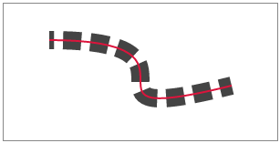 stroke-dashoffset[/caption]
See SVG Specification for details.
The principle is to set the stroke-dasharray length greater than the path, and set stroke-dashoffset equal to stroke-dasharray. At this point, there is no stroke (the leftward offset pushes the first solid segment out of view). Then, as the offset decrements to 0, the first solid segment of the dashed line gradually reveals itself from the left, precisely covering the path when it reaches 0.
Conversely, if stroke-dashoffset is 0 and stroke-dasharray increments from a tiny value to equal the path, the first dashed segment does indeed grow longer, but subsequent segments cannot be hidden, making it unusable for stroke animation.
However, SVG gradient strokes suffer from stitching issues. If you look closely, you can see four breaks on the circle because the gradient segments do not connect smoothly. Although the defined gradient color values are correct and should theoretically connect perfectly, the actual result is suboptimal.
Similarly, using multiple CSS background properties to achieve a gradient border also results in stitching issues, as shown below:
<div class="colorfulBorder"></div>

.colorfulBorder {
    width:100px; height:100px; -webkit-transform:rotate(90deg);
}
.colorfulBorder:before {
    content:"";
    display:block;
    width:100px; height:50px;
    margin-top:10px; padding:10px; padding-bottom:0; box-sizing:border-box;
    border-top-left-radius:50px;
    border-top-right-radius:50px;
    background:-webkit-gradient(
        linear,
        left top,
        right top,
        color-stop(0,#fff),
        color-stop(1,#fff)
    ),-webkit-gradient(
        linear,
        left top,
        right top,
        color-stop(0,#077df8),
        color-stop(1,#74baff)
    );
    background-clip:content-box,padding-box;
}
.colorfulBorder:after {
    content:"";
    display:block;
    width:100px; height:50px;
    padding:10px; padding-top:0;
    box-sizing:border-box;
    border-bottom-left-radius:50px;
    border-bottom-right-radius:50px;
    background:-webkit-gradient(
        linear,
        left top,
        right top,
        color-stop(0,#fff),
        color-stop(1,#fff)
    ),-webkit-gradient(
        linear,
        left top,
        right top,
        color-stop(0,#fff),
        color-stop(1,#74baff)
    );
    background-clip:content-box,padding-box;
}
This flaw makes the entire scheme infeasible.
7. Online Demo
Demo URL: http://www.ayqy.net/temp/progress/circle.html
8. Summary
For solid-colored circular progress bars, the classic "Two Doors" solution is recommended as it adapts to non-solid backgrounds.
For gradient circular progress bars, the options are:
-
If conditions allow, Canvas is preferred as it can adapt to non-solid backgrounds.
-
Otherwise, use white block masking, but only for solid color backgrounds.
SVG stroke animation can implement custom-shaped progress bars (like a winding river), but it is not suitable for gradient strokes (as there are visible gaps where gradients meet).
Implementing gradient borders via multiple CSS background properties is not feasible due to obvious gaps at the junctions.
No comments yet. Be the first to share your thoughts.