I. Advantages of Sass
Using CSS for drawing counts as simple practical exercises, although I've used very little of it... After using it, I found that Sass mainly has the following advantages:
- Maintainability. Most importantly, this largely comes from variables
Well, a simple example: drawing always requires foreground colors, background colors, fill colors, and a bunch of color values. CSS can do this too, but if you need to modify a fill color, you might need to inspect elements to find the specific color value first, then Ctrl+H to replace it throughout the source code. With Sass, it's much simpler—just change the variable value, and it's done. That's right, you don't need to inspect elements to find color values at all, because good variable names are self-explanatory.
- Ease of use. Very smooth to use when you're just getting started
Compatible with CSS syntax while providing extended features, very smooth to use. For example, nested structures represent descendant selectors, which are convenient to use and easy to understand, and can also avoid some writing errors.
- Flexibility. Unbelievably flexible
@mixin provides tremendous flexibility. No parameters, multiple parameters, optional parameters, arbitrary number of parameters—these are more flexible than many programming languages. Flexible interfaces not only facilitate code reuse but also make them easier to use (no need to remember a bunch of function names with similar functionality).
I accidentally discovered a very flexible usage, code as follows:
    // If you simply want to support 1-parameter and 4-parameter forms, you can implement it like this
    @mixin radius ($r1, $r2: $r1, $r3: $r1, $r4: $r1) { // Note that default values are set to other parameter values, this is too flexible
      // As an example, compatibility is not considered here
      border-radius: $r1 $r2 $r3 $r4;
    }

    // If you want to achieve zero redundancy and support 1, 2, 3, 4 parameter forms, you can implement it like this
    @mixin radius2 ($r...) {    // Similar to C++ syntax
      $argNum: length($r);

      @if ($argNum == 1) {      // 1 parameter
        border-radius: nth($r, 1);
      }
      @else if ($argNum == 2) { // 2 parameters
        border-radius: nth($r, 1) nth($r, 2);
      }
      @else if ($argNum == 3) { // 3 parameters
        border-radius: nth($r, 1) nth($r, 2) nth($r, 3);
      }
      @else { // 4 parameters, if more, only take the first 4
        border-radius: nth($r, 1) nth($r, 2) nth($r, 3) nth($r, 4);
      }
    }

    // Test
    h1 {
      @include radius(1px);
      @include radius(1px, 2px, 3px, 4px);

      @include radius2(1px);
      @include radius2(1px, 2px);
      @include radius2(1px, 2px, 3px);
      @include radius2(1px, 2px, 3px, 4px);
    }
Generated CSS code:
    h1 {
      border-radius: 1px 1px 1px 1px;
      border-radius: 1px 2px 3px 4px;
      border-radius: 1px;
      border-radius: 1px 2px;
      border-radius: 1px 2px 3px;
      border-radius: 1px 2px 3px 4px;
    }
4. Reusability. After drawing a snail, drawing a frog, etc., will be very fast
Drawing a snail is just a very simple and independent "project" (well, small but complete...), so I created many utility functions (@mixin). Most utility functions are reusable and can be used to draw frogs, sparrows... Of course, it certainly won't be limited to drawing; other places can use them too.
For example, there can be a @mixin that automatically adds vendor prefixes to properties:
    // Property settings with browser prefixes
    @mixin attr ($name, $value) {
      #{$name}: $value; // Note that #{} must be added on the left side, otherwise it's just assignment
      /* Firefox */
      -moz-#{$name}: $value;
      /* IE */
      -ms-#{$name}: $value;
      /* Opera */
      -o-#{$name}: $value;
      /* WebKit */
      -webkit-#{$name}: $value;
    }
5. Self-explanatory nature. Or semantic benefits
Variable names, @mixin names, @function names can all be semantic. If using CSS, you'd have to add a bunch of comments to explain. Self-explanatory things are not only good for yourself but also good for others in the future.
II. Drawing
Original Little Snail image:
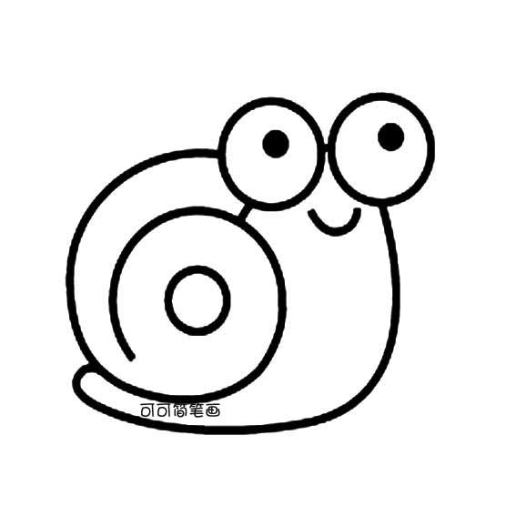
A simple little snail, circles upon circles. Using div corners with 1px before was unrealistic, but after border-radius came along, curves and such became too easy.
1. Decomposing Lines
When drawing with CSS, the first step is definitely to decompose the lines in the image into divs (divs have greater freedom than spans, and have no semantics, perfect for this). Simply put, it's writing HTML.
General rule: decompose from top to bottom, left to right. Each line corresponds to one div. This can largely avoid things like margin-left: -30px;, making the code more readable.
Decomposition result:
<!-- HTML structure -->
<div class="wrapper">
    <!-- Snail overall -->
    <div class="xiaowo">
        <!-- Head -->
        <div class="head">
            <!-- Eyes-->
            <div class="eyes">
                <!-- Left eye -->
                <div class="eye left">
                    <!--Pupil-->
                    <div class="black bleft"></div>
                </div>

                <!-- Short horizontal line -->
                <div class="shortHLine">
                </div>

                <!-- Right eye -->
                <div class="eye right">
                    <div class="black bright"></div>
                </div>

                <!-- Short diagonal line -->
                <div class="shortSlash">
                </div>

                <!-- Mouth -->
                <div class="mouth">
                </div>
            </div>
        </div>

        <!-- Shell -->
        <div class="shell">
            <!-- Inner circle -->
            <div class="innerCircle">
                <!-- Innermost circle -->
                <div class="innerinnerCircle">
                </div>
            </div>
        </div>

        <!-- Right body -->
        <div class="rbody">
        </div>

        <!-- Bottom body -->
        <div class="bbody">
            <!-- Left short arc -->
            <div class="shortArc">
            </div>

            <!-- Bottom long arc -->
            <div class="longArc">
            </div>
        </div>
    </div>
</div>
P.S. The specific decomposition method doesn't really matter. One div per line is definitely more than enough. Just do it first; if you find something redundant later, you can delete it.
2. Writing Sass
With the HTML structure, you can directly start writing styles. The rule is from outside to inside, left to right, bit by bit.
Simple, just needs some patience, debugging pixel by pixel, over and over.
Finished Sass code:
/*!
 * Little Snail - sass
 */

// Variables
$fc: #2b2b2b;
$bc: #fafafa;
$bWidth: 7px;
$bStyle: solid;
$bColor: #2b2b2b;
// Transparent color doesn't consider IE compatibility here, because it's hard to draw curved borders under IE6, and transparency has little meaning
$hidden: transparent;
$border: $bWidth $bStyle $bColor;
$_border: $bWidth $bStyle $hidden;

// Mixin
// 0 ~ none, 1 ~ borderStyle, -1 ~ transparent
@mixin border($t, $r, $b, $l) {
  @if ($t == 1) {
    border-top: $border;
  }
  @else if ($t == -1) {
    border-top: $_border;
  }

  @if ($r == 1) {
    border-right: $border;
  }
  @else if ($r == -1) {
    border-right: $_border;
  }

  @if ($b == 1) {
    border-bottom: $border;
  }
  @else if ($b == -1) {
    border-bottom: $_border;
  }

  @if ($l == 1) {
    border-left: $border;
  }
  @else if ($l == -1) {
    border-left: $_border;
  }
}

// For simplicity, only support 1-parameter or 4-parameter form
@mixin radius ($r...) {
  @if (length($r) == 1) {
    border-radius: nth($r, 1);
    /* Firefox */
    -moz-border-radius : nth($r, 1);
    /* IE */
    -ms-border-radius : nth($r, 1);
    /* Opera */
    -o-border-radius : nth($r, 1);
    /* WebKit */
    -webkit-border-radius : nth($r, 1);
  }
  @else {
    $r1: nth($r, 1);
    $r2: nth($r, 2);
    $r3: nth($r, 3);
    $r4: nth($r, 4);
    border-radius: $r1 $r2 $r3 $r4;
    /* Firefox */
    -moz-border-radius : $r1 $r2 $r3 $r4;
    /* IE */
    -ms-border-radius : $r1 $r2 $r3 $r4;
    /* Opera */
    -o-border-radius : $r1 $r2 $r3 $r4;
    /* WebKit */
    -webkit-border-radius : $r1 $r2 $r3 $r4;
  }
}

@mixin transform ($deg) {
  transform: rotate($deg);
  // IE 9
  -ms-transform:rotate($deg);
  // Firefox
  -moz-transform:rotate($deg);
  // Safari and Chrome
  -webkit-transform:rotate($deg);
  // Opera
  -o-transform:rotate($deg);
}

// Box
.wrapper{
  margin: 10px 0 0 30px;
}

// Little Snail
.xiaowo{
  position: relative;

  // Head
  .head {
    position:relative;
    z-index: 100;
    margin-left: 200px;
    width: 232px;
    height: 125px;
    background-color: $bc;
  }

  // Eyes
  .eyes{
    position: relative;
  }
  .eye{
    position: absolute;
    width: 100px;
    height: 105px;
    @include radius(57px);
    border: $border;
  }
  // Left eye
  .left{
    top: 10px;
    left: -3px;
  }
  // Pupil
  .black{
    position: absolute;
    background-color: #000; // Bright black pupils
    width: 30px;
    height: 32px;
    @include radius(15px);
  }
  // Left pupil */
  .bleft{
    top: 25px;
    left: 40px;
  }
  // Short horizontal line
  .shortHLine{
    position: absolute;
    top: 60px;
    left: 110px;
    width: 12px;
    @include border(0, 0, 1, 0);
  }
  // Right eye
  .right{
    top: 7px;
    right: 0;
  }
  // Right pupil
  .bright{
    top: 25px;
    left: 40px;
  }

  // Short diagonal line
  .shortSlash{
    position: absolute;
    top: 125px;
    left: 32px;
    width: 30px;
    height: 30px;
    border-left: 7px solid #2b2b2b;
    @include transform(20deg);
  }

  // Mouth
  .mouth{
    position: absolute;
    top: 130px;
    left: 92px;
    width: 50px;
    height: 24px;
    @include border(0, 1, 1, 1);
    @include radius(0, 0, 30px, 32px);
  }

  // Shell
  .shell{
    position: absolute;
    top: 75px;
    width: 300px;
    height: 300px;
    @include radius(157px);
    @include border(1, -1, 1, 1);
  }
  // Inner circle
  .innerCircle{
    position: absolute;
    top: 55px;
    left: 50px;
    width: 230px;
    height: 230px;
    @include radius(122px);
    @include border(1, 1, -1, 1);
  }
  // Innermost circle
  .innerinnerCircle{
    position: absolute;
    top: 55px;
    left: 75px;
    width: 80px;
    height: 80px;
    @include radius(47px);
    border: $border;
  }

  // Right body
  .rbody{
    position: absolute;
    top: 60px;
    left: 0px;
    width: 410px;
    height: 345px;
    @include border(-1, 1, -1, -1);
    @include radius(0, 170px, 137px, 0);
  }

  // Bottom body
  .bbody{
    position: absolute;
    top: 317px;
    left: 0;
    width: 300px;
    height: 100px;
  }
  // Left short arc
  .shortArc{
    position: absolute;
    top: 30px;
    left: 27px;
    width: 36px;
    height: 36px;
    @include border(1, -1, -1, 1);
    @include radius(25px);
  }
  // Bottom long arc
  .longArc{
    position: absolute;
    top: -248px;
    left: -5px;
    width: 415px;
    height: 345px;
    @include border(-1, 1, 1, -1);
    @include radius(900px, 630px, 605px, 527px);
  }
}
3. Refinement
Specific tasks:
- Remove excess lines
Use code like border-bottom: 5px solid transparent; to remove excess lines. Note that you cannot use border-bottom: 0; to eliminate, because a bottom border width of 0 will affect other borders (border-radius calculates together with border width).
- Connect curves
After removing excess lines, there will definitely be disconnected lines. Need to reposition to connect curves perfectly.
- Fine-tuning
After connecting, adjust proportions, width and height, curvature, etc., to make it more perfect.
III. Result

P.S. You may have noticed, Sass is actually not suitable for this. Debugging when drawing is done directly against CSS; bringing Sass into it actually makes it more troublesome... But that doesn't matter. When you get a new hammer, you always want to try it out. Now I'm satisfied.
References
-
[An Yu Qing Yang: Let's Learn SASS Together](http://ayqy.net/blog/我们一起学 SASS/)
No comments yet. Be the first to share your thoughts.