1. Scenarios
A timeline list needs to be implemented, featuring a series of small dots on the left and list content on the right. The position of the dots must correspond to the list items. The final effect is as follows:
[caption id="attachment_1220" align="alignnone" width="313"]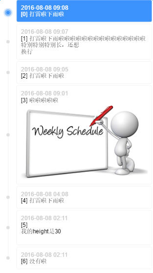 timeline[/caption]
2. Implementation Strategy
There are several details:
-
Dots must be aligned with list items.
-
The timeline for the first and last items should not extend beyond the dots.
-
There must be spacing between list items.
The first two are requirements for adaptability, and the last is a constraint on the layout.
A traditional approach is to generate a sufficiently long vertical line through the list container, then have list items carry their own dots, which are aligned to the vertical line. However, the length of the vertical line cannot be precisely controlled (without JS calculations), which fails the second requirement. An alternative is to have list items carry a vertical line of the same height, which then concatenate to form a complete timeline.
P.S. No need to worry about the joints between the vertical lines being visible; they will be perfectly seamless. Otherwise, it would be unscientific—there shouldn't be inexplicable gaps between two adjacent block-level elements, so their border-left should connect perfectly.
3. Specific Implementation
First, determine the structure. Due to the spacing constraint between list items, the items need an extra layer of wrapping:
.listItem>.listItemContent>.listItemContent-date+.listItemContent-content
Since using margin for spacing would result in incorrect vertical line lengths that won't connect, an extra listItem layer is used, and margin is replaced with padding. The listItem carries the vertical line and the dot:
/* 列表项间隔padding-top */
.listItem {
    position: relative;
    padding-left: 40px;
    padding-top: 4px;
}
/* 列表项自带竖线 */
.listItem:before {
    content: "";
    display: inline-block;
    position: absolute;
    top: 0;
    left: 0;
    width: 1px;
    height: 100%;
    border-right: 1px solid #f3f3f3;
    left: 19px;
    z-index: 1;
}
/* 列表项自带小圆点 */
.listItem:after {
    content: "";
    display: inline-block;
    position: absolute;
    width: 8px;
    height: 8px;
    background-color: #e0e0e0;
    border-radius: 4px;
    left: 16px;
    top: 50%;
    margin-top: -2px;
    z-index: 1;
}
Note the margin-top of the dot. This -2px is not estimated by eye but is related to the item spacing and dot height:
// top 50%, marginTop -50% is for the dot to be vertically centered relative to the listItem
h = listItemContent.height
pt = listItem.paddingTop
ch = dot.height
y = (h + pt)/2 - ch/2
// We want the dot to be vertically centered relative to listItemContent
// We need to remove the downward offset brought by pt, which is pt/2, so
top 50%, marginTop -ch/2 + pt/2
top 50%, marginTop -4 + 2
top 50%, marginTop -2
This is the trouble caused by the extra layer used when converting margin to padding.
Then, add constraints to ensure the timeline for the first and last items does not extend beyond the dots:
.listItem-first:before {
    height: 50%;
    top: 50%;
}
.listItem-last:before {
    height: 50%;
}
Finally, add the highlight effect:
/* 高亮小圆点 */
.listItem.highlight:after {
    -webkit-box-sizing: border-box;
    -moz-box-sizing: border-box;
    box-sizing: border-box;
    width: 16px;
    height: 16px;
    background-color: #3d93fd;
    border: 4px solid #88bdfe;
    border-radius: 8px;
    left: 12px;
    -webkit-box-shadow: 0 0 0 3px #d8e9ff;
    box-shadow: 0 0 0 3px #d8e9ff;
    z-index: 2;
}
/* 高亮列表项 */
.listItem.highlight > .listItemContent {
    background-color: #3d93fd;
    color: #fff;
}
/* 高亮列表项内容 */
.listItem.highlight .listItemContent-date{
    color: #fff;
}
4. Demo
Online Demo: http://www.ayqy.net/temp/timeline/index.html
Click a list item to highlight it. List item content supports HTML and image adaptability.
Afterword
I've been studying the principles of JS animation lately. I'm grateful to senior Yueying for his profound insights.
I've read through it several times before but never fully grasped it until I implemented it myself and discovered the relationship between mathematical formulas and easing operators.
Highly recommended: What You Need to Know About Animations
No comments yet. Be the first to share your thoughts.