1. Problem
Accidentally discovered the check-in calendar turned into this:
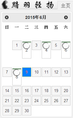
This style issue hadn't appeared before (it should originally be neatly arranged calendar grids). It may be related to the recent update check. Chrome 28 failed to update, and the issue appeared after that.
Chrome 43 seems to have had this issue from the start. At the time, it was puzzling why the new Chrome version would be incompatible with the old version - this isn't Google's style.
2. Cause
I was confident the styles were fine. It was compatible with IE6+, Chrome 28, and FF when launched. This issue definitely wasn't caused by incorrect styles.
From the image, you can see the circled grid cells all have wrong styles, while the uncircled ones are correct. After careful comparison, the only difference between them is that the circled cells have an additional 'check' class. Strangely, inspecting the element and disabling the 'check' style had no effect (the 'check' style only sets a background image). I was completely puzzled.
After scrolling down the style list, I unexpectedly saw another 'check':
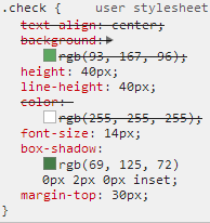
Yes, this was the culprit. The ugly calendar was caused by it. The browser's default style actually has something called 'check'. At least add a prefix..
3. Solution
A more scientific solution from netizens:
-webkit-appearance:none; /* Remove default style */
But it doesn't seem to work.
Alright, we can use the most direct approach: change the class name. I'll give you 'check', I don't want it anymore.
Afterword
Why does Chrome come with such a strange default style? It's really puzzling.
No comments yet. Be the first to share your thoughts.