Preface
With transform and flex, horizontal and vertical centering has become easy, such as the universal:
position: absolute;
top: 0; bottom: 0; left: 0; right: 0;
/* 1.Content top-left corner centered */
top: 50%; left: 50%;
/* 2.Negative half width/height to move content back */
-webkit-transform: translate(-50%, -50%);
The key is to leverage the transform percentage calculation relative to its own width and height. If the environment doesn't support transform, some older but very ingenious techniques are needed.
margin Centering
An obvious method:
position: absolute;
top: 0; bottom: 0; left: 0; right: 0;
/* 1.Requires content to be centered relative to containing block */
margin: auto;
/* 2.Specify width/height calculation method */
width: 100px; height: 100px;
Principle
The key is to leverage margin calculation rules:
'left' + 'margin-left' + 'border-left-width' + 'padding-left' + 'width' + 'padding-right' + 'border-right-width' + 'margin-right' + 'right' = containing block width

'top' + 'margin-top' + 'border-top-width' + 'padding-top' + 'height' + 'padding-bottom' + 'border-bottom-width' + 'margin-bottom' + 'bottom' = containing block height
(Quoted from 10.3.7 Absolutely positioned, non-replaced elements, 10.6.4 Absolutely positioned, non-replaced elements)
margin centering is about adding constraints to the equations above:
margin-top === margin-bottom && margin-left === margin-right
This is the core of using margin to achieve centering.
The 2 steps in CSS have actual meanings as follows:
-
Specify
margincalculation method. If other necessary values can be calculated,autorequiresmarginto divide remaining space equally. -
Specify necessary value calculation methods.
The "necessary values" here should be viewed separately. In the horizontal direction, they are left, right, width, because there are the following rules:
If 'left', 'width', and 'right' are all 'auto'...
If none of these 3 values are 'auto'...
Otherwise, set 'margin-left' and 'margin-right' with value 'auto' to 0, then pick 1 suitable rule from the 6 rules below to apply.
5.If 'width' is 'auto', and 'left' and 'right' are not 'auto', then solve for 'width'.
That is to say, if
left: 0;
right: 0;
width: auto;
then
margin-left: auto;
margin-right: auto;
the actual effect is
left: 0;
right: 0;
margin-left: 0;
margin-right: 0;
width: auto;
margin auto becomes invalid (wiped out to 0), so width is a necessary value and must specify its calculation method, such as a numeric value, percentage, or constraint, such as max-width.
In the vertical direction, it's top, bottom, height, and the corresponding rules are similar to the horizontal direction:
5.If 'height' is 'auto', and 'top' and 'bottom' are not 'auto', then set 'margin-top' and 'margin-bottom' with value 'auto' to 0, then solve for 'height'.
So height is also a necessary value.
Looking at it this way, the most obvious t: 0, b: 0, l: 0, r: 0 is not the focus. Like width, height, they are just necessary values to make margin auto calculable. So it should be arranged like this:
position: absolute;
/* 1.Requires content to be centered relative to containing block */
margin: auto;
/* 2.Specify necessary values required for margin auto calculation */
top: 0; bottom: 0; left: 0; right: 0;
width: 100px; height: 100px;
Moreover, having all tblr as 0 is obviously unnecessary:
top: 30px; bottom: 30px; left: 50px; right: 50px;
is also acceptable. Furthermore, tblr can even be used to offset the difference in top/bottom (left/right) padding, border-width.
Pros and Cons
Disadvantages:
-
Cannot handle scenarios with indefinite content height (scenarios where
heightmust beauto) -
Invalid in WP (assuming it can be ignored)
Advantages:
-
Compatible with [IE8+]
-
Supports
resize(still centered when user drags the content's bottom-right corner)
inline Centering
A quite clever method:
.center-inline-container {
    /* 1.Content horizontal centering */
    text-align: center;
}
.center-inline-container:before {
    /* Zero-width space */
    content: '\200B';
    display: inline-block;
    /* 2.Stretch content height */
    height: 100%;
    vertical-align: middle;
}
.center-inline-content {
    display: inline-block;
    /* 3.Vertical centering */
    vertical-align: middle;
}
Principle
The key is to leverage vertical-align: middle; to achieve vertical centering:
Align the vertical midpoint of the box with the baseline of the parent box plus half the parent's x-height.
That is to say:
Content vertical midpoint position = Parent box baseline position + Parent's half x-height
First, determine the parent box's baseline position:
The baseline of an 'inline-block' (box) is the baseline of its last line box in the normal flow, unless it has no in-flow line boxes or its 'overflow' property's computed value is not 'visible', in which case the baseline is the bottom margin edge.
Need to continue looking for "the baseline of its last line box in the normal flow":
The rectangular area that contains boxes from the same line is called a line box.
CSS 2.1 does not define the position of the line box baseline.
Encountered a problem; the specification doesn't say where the line box baseline is positioned, but it gives constraints:
Inline-level boxes are aligned vertically according to their 'vertical-align' attribute. If they are aligned 'top' or 'bottom', they must be aligned to minimize the line box height.
After satisfying these indirect constraints, then determine the line box baseline position. So the influencing factors for line box baseline position are:
-
vertical-align,height,line-heightof inline-level boxes in the line box -
line-heightof the container where the line box is located -
Others (possibly more)
The line box baseline position may differ under different cases, but it's easy to mark out the final baseline position:
Just add a character at the beginning of the line in questions.
Generally, add a lowercase letter x; the position right against the bottom of x is the baseline.
Next, determine "parent's half x-height", which is relatively easy:
ex: The 'x-height' of the relevant font.
The 'ex' unit is defined according to the element's first available font. An exception is when 'ex' appears in the value of the 'font-size' property, in which case it references the parent element's 'ex'.
It's called 'x-height' because it usually equals the height of lowercase "x". However, 'ex' is also defined in fonts that don't contain "x".
A font's x-height can be obtained through several different methods. Some fonts contain reliable specifications for x-height. If reliable font specifications are unavailable, the UA can determine x-height based on the height of a lowercase glyph. One possible heuristic is to look at how far the glyph of lowercase "o" extends below the baseline and subtract its bounding box's top value. If determining x-height is sometimes impossible or impractical, 0.5em should be used.
That is to say:
x-height = current font's x-height || determine x-height based on a lowercase glyph's height || 0.5em
So "half x-height" (0.5ex) is approximately 0.25em.
Looking at the 3 steps in CSS again:
-
Horizontal centering is not a problem.
-
The pseudo-element stretches the line box height to fill the container,配合
vertical-align: middle;pulls the line box baseline position to near the container's center. -
Content center point aligns with the position
0.5exabove the line box baseline.
Seeing this, it's clear that vertical direction is not actually centered:
-
Line box baseline does not equal container center.
-
Position
0.5exabove line box baseline also does not equal container center.
The final two centers don't align, so centering achieved this way has flaws, with pixel-level differences, as shown below:
[caption id="attachment_1456" align="alignnone" width="900"]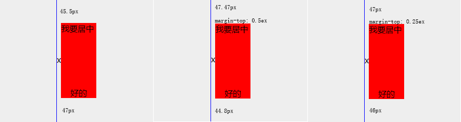 css-center-inline[/caption]
Can try to fix with margin-top, but because line box baseline has no definite calculation method, perfect fix is impossible. From the Demo, 0.25ex seems most suitable. In actual applications, fine-tuning may be needed (if pixel-level flaws matter).
Pros and Cons
Disadvantages:
-
Pixel-level flaws exist and cannot be resolved; not perfect vertical centering.
-
HTML whitespace characters occupy space, affecting horizontal centering (compress HTML, or container
font-size: 0, content resetfont-size). -
Requires extra element/pseudo-element.
Advantages:
-
Compatible with [IE8+]
-
Supports indefinite height content.
Online Demo
Demo address: http://ayqy.net/temp/css-center.html
P.S. Styles, structure, and notes are all in the source code.
References
-
Vertical-Align: All You Need To Know: Combines CSS specification to sort out line box, inline box, baseline, etc., pending translation
No comments yet. Be the first to share your thoughts.