1. Purpose
Similar to media queries, feature queries are a type of conditional style that applies a set of style rules only in environments that support specific style rules:
The @supports CSS at-rule lets you specify declarations that depend on a browser's support for one or more specific CSS features. This is called a feature query.
Wait, this capability seems to have been built into CSS from the start:
To ensure that new properties and values can be added to existing properties in the future, user agents must ignore a portion of an illegal stylesheet, such as declarations containing unknown properties, declarations containing illegal values, @-rules with unknown @-keywords, and so on.
P.S. See 4.2 Rules for handling parsing errors for details.
CSS has been fault-tolerant since its inception; style rules supported in the current environment are applied correctly, while unsupported ones are silently ignored:
Browsers simply skip over code they don’t understand, without throwing an error.
For example, we often see:
.card {
  margin: 10px;
  border: 1px solid #ddd;
  box-shadow: 3px 5px 5px #eee;
}
We know that in environments that support box-shadow, it will render a shadow, making it look like a floating card. In unsupported environments, only the margin and border remain, turning it into a flat, ordinary rectangle—effectively a natural style fallback. This inclusive capability makes the application of new features less worrying (if unsupported, it simply reverts to the fallback plan).
So, what capabilities does feature query bring?
It acts as a built-in, friendly progressive enhancement mechanism. For things previously done with Modernizr, there is now another choice, such as:
Override one layout method with another.
The difference from before is that, in terms of impact scope, fault-tolerant fallback only affects the elements where those unsupported styles are applied, whereas feature query fallback can affect a group of arbitrary elements. For example:
.card {
  margin: 10px;
  border: 1px solid #ddd;
}
@supports (box-shadow: 3px 5px 5px #eee) {
  /* 影响其它元素,之前依靠CSS容错降级是做不到的 */
  body:before {
    content: 'box-shadow is supported!';
    background-color: green;
  }

  .card {
    box-shadow: 3px 5px 5px #eee
  }
}
P.S. Strictly speaking, fault-tolerant fallback is usually declaration-level (some declarations are ignored or applied), while feature query fallback is ruleset-level (some rulesets are ignored or applied):
A declaration is either empty or consists of a property name, followed by a colon (:), followed by a property value. Between each of these, there may be white space.
A ruleset (also called a "rule") consists of a selector followed by a declaration block.
2. Syntax
Syntactically, a feature query is called the @supports CSS at-rule. Here is a comparison with media queries:
@supports (display: grid) {
  div {
    display: grid;
  }
}

@media screen and (min-width: 900px) {
  article {
    padding: 1rem 3rem;
  }
}
They look very similar; both indicate that when the condition after the @keyword is met, the style rules inside {...} are applied. Both are conditional group rules (conditional group rules):
/* General structure */
@IDENTIFIER (RULE) {/* CSS block */}

/* @supports CSS at-rule */
@supports <supports-condition> {
  <group-rule-body>
}
Additionally, the condition part supports logical operations: and, or, and not:
@supports (display: grid) and (not (display: inline-grid))
@supports (transform-style: preserve) or (-moz-transform-style: preserve)
P.S. Only conditions in the form of property name-value pairs are supported; other forms are not, such as:
@supports (@charset "utf-8") {
  /* 样式规则 */
}
3. Usage
In actual scenarios, the general pattern (best practice) is:
/* 降级样式-针对低端环境 */

@supports (前沿特性) {
  /* 增强样式-针对高端环境 */
  /* 必要的话,覆盖某些降级样式 */
}
It is important to note that not supporting a feature is not equivalent to a negative feature query (@supports not):
@supports not (height: 100vh) {
  /* 期望仅在不支持vh的环境应用这组样式规则 */
}
This cannot reliably filter for environments that do not support vh because if the browser doesn't even support @supports, the entire @-rule will be ignored, including these fallback styles. In other words, this check is unreliable and will miss some environments (those that support neither @supports nor vh).
Similarly, positive feature queries are not entirely reliable either, for example:
@supports (height: 100vh) {
  /* 期望仅在支持vh的环境应用这组样式规则 */
}
In environments that do not support @supports but do support vh, this will not behave as expected. However, this is usually not a major concern because the features being checked for support are typically more cutting-edge than feature queries themselves.
4. Graceful Degradation and Progressive Enhancement
These are two similar strategies for dealing with browser inconsistencies, with the following differences:
-
Graceful Degradation: Prioritizes high-end environments and makes compromises for low-end ones (all effects enabled, with fallbacks for low-end environments, ensuring basic usability as the bottom line).
-
Progressive Enhancement: Prioritizes low-end environments and provides special treatment for high-end ones (ensure the baseline of usability first, then consider adding advanced features).
Graceful degradation starts complex with a goal of providing a simple experience when needed. Progressive enhancements starts simple and then adds on to that with the desired feature-rich experience.
Modernizr
Modernizr is a general feature detection solution that checks whether the running environment supports a specific feature via JS:
Modernizer checks if a feature is available in the browser and returns true or false.
In short, Modernizr helps distinguish between high-end and low-end environments, allowing us to provide fallbacks for low-end environments or apply patches (polyfills). For example:
if (Modernizr.awesomeNewFeature) {
  showOffAwesomeNewFeature();
} else {
  getTheOldLameExperience();
}
As a JS solution, its advantage is that it's flexible enough to check not only CSS features but all features detectable via JS, such as:
// 媒体特征
var query = Modernizr.mq('(min-width: 900px)');
if (query) {
  // the browser window is larger than 900px
}
// DOM事件
Modernizr.hasEvent('blur') // true;
// 插件特性
Modernizr.on('flash', function( result ) {
  if (result) {
  // the browser has flash
  } else {
    // the browser does not have flash
  }
});
However, there are several issues:
-
Performance: Requires additional JS; as more features are detected, the file size grows, creating a performance burden.
-
Extensibility: Relies on third-party support; new features might take time before detection is available, requiring manual updates to Modernizr versions.
-
Ease of Use: You must look up the target feature name (e.g.,
batteryapi,flexbox, etc.; see Features detected by Modernizr) before checking, which is inconvenient. -
Feature Granularity: The minimum unit of detection is the feature name, which may not always be appropriate; for instance, there might not be a feature name for
justify-content: space-evenly. -
Reliability: Relying on external means to detect feature support isn't 100% reliable, especially for partial implementations that might not be accurately distinguished.
CSS Feature Query
Browser-native support for CSS feature detection. The browser itself knows best whether it supports a certain style rule; feature queries simply expose this internal state.
Compared to Modernizr, it has several advantages:
-
Better Performance: A pure CSS solution that doesn't require JS.
-
Good Extensibility: As a basic browser capability, any new feature can be detected immediately upon release without manual extensions.
-
Natural Syntax: Uses style declarations as query conditions instead of looking up feature names in a table.
-
Fine Granularity: Operates at the property name-value pair level, offering great flexibility.
-
Reliable: Support is determined by the browser itself, making it completely accurate.
Of course, the disadvantage is that it only supports style feature queries; it is powerless for non-CSS features. Therefore, in terms of functionality, Modernizr is a superset of CSS feature queries.
5. Compatibility
-
Desktop:
Firefox,Chrome,[Safari 9+],[Edge 12+]([IE 11-]and below are not supported). -
Mobile:
[iOS 9.0+],[Android 4.4+].
P.S. See Can I use for details.
It's basically safe to use on mobile now; even if @supports is not supported, there is no major impact (it will simply ignore the styles, consistent with low-end environment behavior).
Specifically, a few points to note:
-
Feature queries do not help identify buggy feature implementations or incomplete implementations (e.g., supporting the property but not a specific mechanism that cannot be distinguished by name/value).
-
Compatibility issues with the feature query itself can lead to cases where behavior is not as expected (e.g., a feature is supported, but ignored because
@supportsisn't), but it won't cause severe issues.
A typical example is Safari 8, which supports Flexbox but not feature queries, resulting in a bad case:
Safari 8 is likely the biggest problem when it comes to Feature Queries, not Internet Explorer. There are many newer properties that Safari 8 does support — like Flexbox. You probably don’t want to block Safari 8 from these properties.
For example:
body {
  background-color: red;
}

@supports (display: flex) {
  body {
    display: flex;
    background-color: green;
  }
}
In Safari 8, it will show the fallback style even though it supports Flexbox.
6. Application Scenarios
In terms of application scenarios, feature queries are used to resolve concerns about new feature compatibility as a means of progressive enhancement. General usage:
/* 兼容性可靠的样式:保证可访问性 */

@supports (/* 兼容性不太可靠的新特性 */) {
  /* 增强:支持的话,用更简单、效率更高、更强大的方案 */
}
Progressive enhancement means accepting inconsistencies across multiple environments. In practice, it's easy to accept these inconsistencies for things like shadows, rounded corners, and animations (removing these decorative effects in unfriendly environments). However, for layout schemes like Flexbox and Grid, it seems harder to associate them with progressive enhancement because layouts are usually indispensable, not just decorative.
Progressively Using Grid Features
Is There A CSS Grid Polyfill?
Grid does things that are pretty much impossible with older layout methods. So, in order to replicate Grid in browsers that don’t have support, you would need to do a lot of work in JavaScript.
Regrettably, there is no CSS polyfill for Grid layout. Does that mean we have to wait years to use this powerful feature?
Certainly not. There are at least two choices:
-
Use a JS polyfill, such as FremyCompany/css-grid-polyfill.
-
Use Grid features progressively (i.e., only in supported environments, accepting layout differences in different environments).
There isn't much to say about the JS polyfill approach. For the progressive approach, the key is accepting the difference:
Websites do NOT need to look the same on every browser.
Treat the layout effect as an enhancement style (like shadows or rounded corners), allowing low-end environments to display a different fallback layout effect. For example:
<div class="grid">
  <div class="one">One</div>
  <div class="two">Two</div>
  <div class="three">Three</div>
</div>
The corresponding style is:
* { box-sizing: border-box; }

.grid {
  display: grid;
  grid-template-columns: 1fr 1fr 1fr;
  grid-auto-rows: 100px;
  grid-gap: 20px;
}

.grid > * {
  padding: 10px;
  border: 5px solid rgba(214,129,137,.5);
  border-radius: 5px;
  background-color: rgba(233,78,119,.5);
  color: #fff;
  float: left;
  width: 33%;
}

@supports (display:grid) {
  .grid > * {
    width: auto;
  }
}
(Taken from display: feature queries demo)
In environments that support Grid, it renders as a beautiful, distinct 3-column proportional layout. In unsupported environments, it falls back to a slightly crowded float layout:
[caption id="attachment_1785" align="alignnone" width="625"]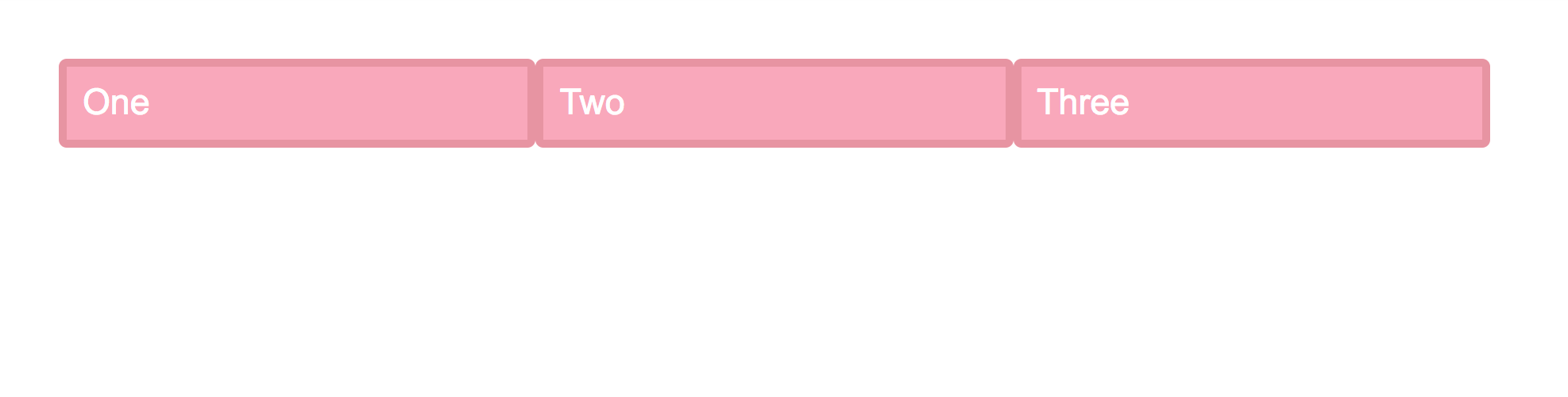 grid-layout-css-polyfill[/caption]
It's barely satisfactory, but without changing the structure or using JS, the float solution can only go so far. If such differences are acceptable, using feature queries progressively makes the compatibility issues of new features no longer critical.
Checking for Custom Property Support
@supports (--foo: green) {
  :root {
    --theme-color: gray;
  }

  .variable {
    color: var(--theme-color);
  }
}
Using CSS Variables, it's easy to provide theme-switching functionality as an enhancement.
Drop Caps Effect
In environments that support initial-letter (such as Safari), it's easy to achieve this common typographic effect (the first letter of a paragraph dropping 4 lines):
@supports (initial-letter: 4) or (-webkit-initial-letter: 4) {
  p::first-letter {
    -webkit-initial-letter: 4;
    initial-letter: 4;
    color: #FE742F;
    font-weight: bold;
    margin-right: .5em;
  }
}
If unsupported, implement it using conventional methods:
p::first-letter {
  float: left;
  font-size: 4em;
  color: #FE742F;
  font-weight: bold;
  margin-right: .5em;
}
P.S. For more cases, see the references related to feature queries, such as mix-blend-mode, etc.
No comments yet. Be the first to share your thoughts.