I. Examples
[caption id="attachment_1523" align="alignnone" width="700"]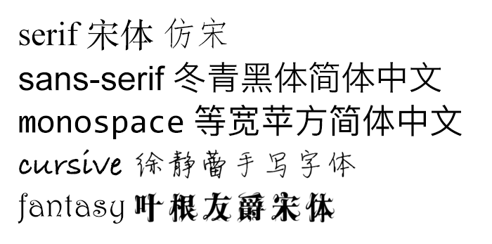 generic-font-families[/caption]
P.S. For more English font examples, see References - Five Generic Font Families English Examples
P.S. For more Chinese font examples, see References - The Complete Beginner's Guide to Chinese Fonts
II. Purpose
Generic font families are a fallback mechanism, a means of preserving some of the style sheet author's intent in the worst case when none of the specified fonts can be selected.
(From 15.3.1 Generic font families)
Since not all fonts are available on all terminal devices (there are thousands of fonts, and most are not free), CSS provides a fallback mechanism: first list the desired fonts, then list the substitute fonts, and finally end with a generic font family.
In the worst case (when none of the specified fonts are available), this method can preserve some of the stylesheet author's intent.
There are 5 generic font families in total: serif, sans-serif, monospace, cursive and fantasy. The first 3 are relatively commonly used (serif, sans-serif and monospace font families).
III. Characteristics
serif Font Family
Characteristics:
-
Has decorated strokes, outwardly spreading or pointed ends, or ends with actual serifs
-
Both ends of each stroke have some decorative variation, for example, Songti (SimSun) stroke ends have a brush calligraphy feel
-
There are differences at the ends of characters, making them still easy to recognize at small font sizes. But at large font sizes, the decorative parts of strokes may appear blurry or jagged
Examples:
-
Times New Roman, MS Georgia
-
Songti (SimSun), FangSong
Derivatives:
- petit-serif Small Serif Font Family
End variations are not obvious, can be treated as sans-serif
- slab-serif Slab Serif Font Family
End variations are very obvious
sans-serif Font Family
The sans- prefix is French, pronounced /san/, meaning "without"
Characteristics:
-
Has clear stroke ends—with little or no outwardly spreading, intersecting strokes, or other decorations
-
Compared to "serif fonts", if the font size is relatively small, it will appear somewhat difficult to distinguish, especially easy to lose place when reading paragraphs
Examples:
-
MS Trebuchet, MS Arial, MS Verdana
-
Heiti (SimHei), YouYuan, Lishu, Kaiti
cursive Handwritten Font Family
Characteristics:
- Looks like handwriting
Examples:
-
Caflisch Script, Adobe Poetica
-
Xu Jinglei Handwritten, Mini Simplified Huangcao, STXingkai, Girl Style
fantasy Decorative Font Family
Characteristics:
- Artistic fonts, mainly used for images, rarely used on pages
Examples:
-
WingDings, WingDings 2, WingDings 3, Symbol
-
Radish Style
monospace Monospace Font Family
Characteristics:
- Each glyph has equal width, mainly used for English; Chinese square characters are already monospace by nature
Examples:
-
Courier, MS Courier New, Prestige
-
Most Chinese fonts
IV. Usage Principles
Common sense:
-
Don't use 3, 4 or even more fonts on a single page
-
If not necessary, don't change fonts within sentences
-
sans-serif for online media, serif for printing devices
-
monospace for typewriters and code
-
Don't use sans-serif for small font size scenarios; serif fonts are easier to recognize
Best practices:
- sans-serif is the page's first choice, sans-serif
Because on screen display devices, serifs make text harder to recognize
- serif is not suitable for online reading, but prints very well, suitable for page print versions
Serif fonts are easier to read in printing scenarios, making it easier for people to clearly distinguish different letters. Printers have finer resolution requirements (355ppi), details are displayed clearly at high resolution, and won't appear blurry like screen display
- monospace for code examples
Each character has equal width, occupying the same space on the page; typewriters use this font
- Don't use fantasy and cursive for body text
Can be used in images or title bars
Final Notes
Don't use Songti (SimSun) for PPT is not nonsense
References
-
Five Generic Font Families Specified in CSS (serif, sans-serif, etc.)
-
CSS: fonts: Five Generic Font Families English Examples
-
The Complete Beginner's Guide to Chinese Fonts: Chinese Font Examples
-
Five Font Families: Evolution of English Letter A
-
Let's Discover Mac's Built-in Font Library [English Fonts - Complete]~
-
Font Families - Serif, Sans-Serif, Monospace, Script, Fantasy Screen and Print Resolution
No comments yet. Be the first to share your thoughts.