一.場景
「吸頂」是一種比較老的互動方式,在 PC 頁面已經用了多年,如圖:
[caption id="attachment_1210" align="alignnone" width="539"]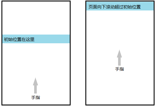 sticky[/caption]
吸頂元素的初始位置一般靠近頁面頂部,但與頂部有一定距離,這塊區域放的是最醒目的元素,比如 Banner 圖。頁面向下捲動超過吸頂元素初始位置時,把吸頂元素固定在頂部
要求吸頂的元素一般是二級導覽列、搜尋框、文章標題列(h1)、表頭(thead)、tab 條等等,共同特點是在內容或功能上比較重要,但又不是最重要的元素(最重要的元素通常固定在頁面頂部,navbar-fixed-top)
二.PC 解決方案
頁面捲動到一定位置時,做一些事情
「回到頂部」按鈕也是這樣的,頁面向下捲動超過 150px 時,顯示該按鈕,否則隱藏
所以實作思路是監聽 scroll 事件:
var stickyEl = document.querySelector('.sticky');
var stickyT = stickyEl.offsetTop;
window.onscroll = function(e) {
    var scrollT = document.body.scrollTop;
    // console.log(scrollT, stickyT);
    if (scrollT > stickyT) {
        stickyEl.classList.add('fixed-top');
    }
    else {
        stickyEl.classList.remove('fixed-top');
    }
};
和「回到頂部」的實作方式一模一樣,效果好像還不錯,但很快會發現捲動到臨界位置 stickyT 的時候,頁面抖了一下,向上縮了一截。因為 stickyEl 此時 fixed 出去了,下面的元素上來,搶佔 sticky 元素原本位置,所以頁面抖了一下
我們希望平滑,不要抖動,所以還需要一個佔位符,守住 stickyEl 原本位置:
var stickyEl = document.querySelector('.sticky');

// 守家佔位符
var stickyHolder = document.createElement('div');
var rect = stickyEl.getBoundingClientRect();
// console.log(rect);
stickyEl.parentNode.replaceChild(stickyHolder, stickyEl);
stickyHolder.appendChild(stickyEl);
stickyHolder.style.height = rect.height + 'px';

var stickyT = stickyEl.offsetTop;
window.onscroll = function(e) {
    var scrollT = document.body.scrollTop;
    // console.log(scrollT, stickyT);
    if (scrollT > stickyT) {
        stickyEl.classList.add('fixed-top');
    }
    else {
        stickyEl.classList.remove('fixed-top');
    }
};
把吸頂元素用相同高度的佔位符包起來,臨界位置 stickyEl 被 fixed 出去,空間由 stickyHolder 撐起來,下面元素擠不上來,頁面不抖了
這樣做還有一些問題,吸頂元素上方的各個元素載入很慢的話,拿到的 stickyT 比實際的小,甚至為 0(如果上方是一張很大的 Banner 圖的話)。所以需要配合預設圖片佔位符(base64)使用,或者偷懶先用 min-height 頂著,上方圖片 onload 時再修正 stickyT
三.行動端解決方案
從原理上看,直接搬過來是可以的。在 Android 4.0+ 確實可以,但iOS 幾乎全家都行不通
Android scroll
Android 4.0 的 scroll 事件不那麼即時(自帶節流的感覺),但 Android 4.1 之後 scroll 事件和 PC 幾乎沒什麼區別
The Android browser in Ice Cream Sandwich fires the event but doesn’t feel very responsive and only sporadically re-paints the DOM to move the blue box. Luckily, Jelly Bean’s Android browser handles this example perfectly; everything is updated and rendered smoothly as the user scrolls.
(引自參考資料 1)
只要頁面還在捲動, scroll 事件就瘋狂觸發,需要手動節流,這正是我們需要的效果。如果 scroll 本身自帶節流,就很容易錯過臨界點判斷,導致吸頂元素「跳一下」,體驗不平滑
iOS scroll
iOS 8- 的 Safari,包括 UIWebView,對 scroll 事件做了很大限制:
手指滑動螢幕 -> 捲動 -> 手指抬起 -> 慣性捲動 -> 停止捲動
整個過程,直到停止捲動時才會觸發 1 次 scroll 事件,也就是說,iOS 8 以下的 scroll 變成了 scrollend。監聽捲動判斷位置的方法完全失效,平滑吸頂效果變成了滾過臨界位置直到停止捲動時,吸頂元素跳到目標位置,體驗非常差,不可忍受
scroll 不能用,但還可以有一些奇怪的思路,比如計時器讀 scrollTop, touchmove, iscroll 等等
有前輩做了詳細測試,見參考資料 1
計時器在手指沒有離開螢幕時不會執行, touchmove 觸發頻率足夠,也能拿到 scrollTop,但 touchend 後,慣性捲動期間,沒有任何事件可用,拿不到這段的 scrollTop,很難預測這段慣性捲動距離(減速運動),甚至不確定各 iOS 版本這段距離的計算方式是否相同
iscroll 這種假捲動,自然可以即時獲取捲動位置, iscroll 有一個專用版本來做這個事情:
iscroll-probe.js, probing the current scroll position is a demanding task, that's why I decided to build a dedicated version for it. If you need to know the scrolling position at any given time, this is the iScroll for you. (I'm making some more tests, this might end up in the regular iscroll.js script, so keep an eye on it).
iOS 8+ 的 Safari 和 WKWebView 能夠瘋狂觸發 scroll,無論手指在不在螢幕上,無論是不是慣性捲動期間。但 iOS 8+ 的 UIWebView, scroll 限制還在
如果要支援 iOS 8- 設備以及任意 iOS 版本的 UIWebView,此路不通,忘掉 scroll
sticky
雖然 scroll 方案行不通,但 iOS 提供了另一種方式: position: sticky,自 iOS 6.1 就支援了,最近 Chrome 56 才支援
這個 CSS 規則專門負責吸頂,一般用法:
.sticky {
    // 滾過初始位置時自動吸頂
    position: -webkit-sticky;
    position: sticky;
    // 吸頂時的定位
    top: 0;
    left: 0;
    // z比下方所有z高
    z-index: 9999;
}
沒有滾過初始位置時,和 position: relative 表現類似(佔據空間, !static 能為後代元素提供定位參照),但 top 和 left 無效
滾過初始位置時,和 position: fixed 表現類似, top 和 left 生效,固定在螢幕可見區域,但頁面不會抖動,原本佔據的空間還在(自帶守家佔位符的感覺)
吸頂效果非常平滑,比 Android scroll 方案體驗更平滑,但限制很明顯,無法即時得知吸頂狀態,與此相關的各種效果都受限制,比如吸頂 tab 列表:
[caption id="attachment_1211" align="alignnone" width="255"]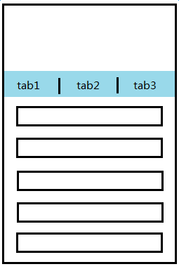 sticky-tab[/caption]
非吸頂狀態時可以滑動列表部分,讓頁面捲動,轉到吸頂狀��,多個 tab 列表無縫切換,瀏覽狀態互不影響
吸頂狀態時滑動當前 tab 列表,到頭,讓頁面捲動,轉到非吸頂狀態
也就是說,非吸頂狀態時,讓 tab 列表不能捲動( overflow-y: hidden );吸頂狀態時,讓 tab 列表可以捲動( overflow-y: auto )
但是 iOS sticky 不由我們控制,且無法即時得知吸頂狀態,想要得知吸頂狀態的話,又回到了最初的問題,頁面捲動過程中,怎樣即時得知捲動條位置?CSS sticky 並不能解決這個問題
筆者還沒有找到合適的解決方案,目前方案是犧牲 tab 瀏覽狀態獨立性,多 tab 共用 body 的捲動條,切換 tab 時滾回之前的位置。這樣做避免了判斷吸頂狀態,但犧牲了 tab 列表無縫切換的完美體驗
如果有新思路、好點子,或者成熟方案,麻煩告知,感激不盡
四.線上 Demo
-
PC、Android 4.0+ 及
WKWebView方案: http://www.ayqy.net/temp/sticky/sticky-pc.html -
iOS 6.1+ 方案: http://www.ayqy.net/temp/sticky/sticky-ios.html
五.總結
-
一般元素吸頂:Android 用
scroll方案,在效果可接受範圍內手動節流,提升效能;iOS 用 CSSsticky,如果不需要相容 iOS 8- 以及任意版本UIWebView的話,也可以採用scroll方案 -
吸頂 tab 列表:沒有好的解決方案,暫用犧牲無縫切換的方案
整頁 iScroll 是一個冒險方案,頁面複雜的話,不要輕易嘗試,即便頁面不複雜,也難保以後不會變得複雜
參考資料
-
onscroll Event Issues on Mobile Browsers:一篇詳盡的
scroll事件測試,幫很多人節省了很多時間 -
Why the Scroll Event Change in iOS 8 is a Big Deal:實例介紹 iOS 8 取消
scroll事件限制後的變化,也是上面的前輩寫的 -
javascript scroll event for iPhone/iPad?:圖解 iOS 的
scroll事件限制 -
CSS “position: sticky” – Introduction and Polyfills:polyfills 都是針對 PC 的,沒什麼用
暫無評論,快來發表你的看法吧