一.場景
需要實現時間軸列表,左邊一串小圓點,右邊是列表內容,需要小圓點位置與列表項對應,最終效果如下:
[caption id="attachment_1220" align="alignnone" width="313"]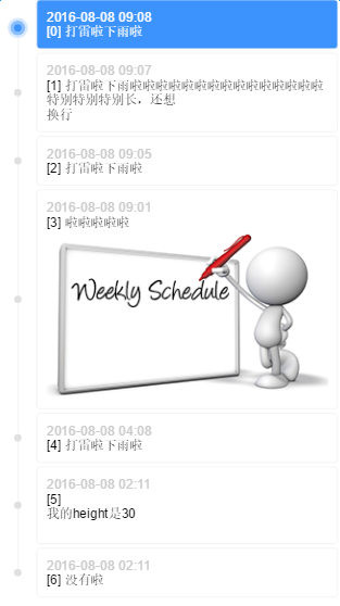 timeline[/caption]
二.實現方案
有幾個細節:
-
小圓點要與列表項對齊
-
首項、末項的時間線不能超出小圓點
-
列表項之間要有間隔
前兩條是對自適應的要求,最後一條是對佈局的限制
傳統方案是透過列表容器生成一條足夠長的豎線,然後列表項自帶小圓點,再把小圓點對齊到豎線上。豎線的長度沒有辦法精確控制(不透過 js 計算的話),無法滿足第二條,那麼可以換個方式,讓列表項自帶同高度的豎線,拼接成完整的時間線
P.S. 不用擔心拼接出來的豎線會被看出來,一定是完美無縫的,否則瀏覽器不科學(兩個相鄰的塊級元素之間不能有無法解釋的縫隙吧,那麼他們的 border-left 一定能夠完美連接起來)
三.具體實現
首先確定結構,因為列表項間隔的限制,列表項需要多套一層:
.listItem>.listItemContent>.listItemContent-date+.listItemContent-content
因為用 margin 實現間隔的話豎線長度不對,接不起來,所以多套一層 listItem ,把 margin 換成 padding 。由 listItem 攜帶豎線和小圓點:
/* 列表项间隔padding-top */
.listItem {
    position: relative;
    padding-left: 40px;
    padding-top: 4px;
}
/* 列表项自带竖线 */
.listItem:before {
    content: "";
    display: inline-block;
    position: absolute;
    top: 0;
    left: 0;
    width: 1px;
    height: 100%;
    border-right: 1px solid #f3f3f3;
    left: 19px;
    z-index: 1;
}
/* 列表项自带小圆点 */
.listItem:after {
    content: "";
    display: inline-block;
    position: absolute;
    width: 8px;
    height: 8px;
    background-color: #e0e0e0;
    border-radius: 4px;
    left: 16px;
    top: 50%;
    margin-top: -2px;
    z-index: 1;
}
注意小圓點的 margin-top ,這個 -2px 不是目測的,與列表項間隔和小圓點高度有關:
// top 50%, marginTop -50%是小圆点相对于listItem竖直居中
h = listItemContent.height
pt = listItem.paddingTop
ch = 小圆点.height
y = (h + pt)/2 - ch/2
// 我们想要小圆点相对于listItemContent竖直居中
// 要去掉pt带来的向下偏移offsetY = pt/2 所以
top 50%, marginTop -ch/2 + offsetY
top 50%, marginTop -4 + 2
top 50%, marginTop -2
這是 margin 轉 padding 套一層帶來的麻煩
然後加上首項、末項的時間線不能超出小圓點的限制:
.listItem-first:before {
    height: 50%;
    top: 50%;
}
.listItem-last:before {
    height: 50%;
}
最後添上高亮的效果:
/* 高亮小圆点 */
.listItem.highlight:after {
    -webkit-box-sizing: border-box;
    -moz-box-sizing: border-box;
    box-sizing: border-box;
    width: 16px;
    height: 16px;
    background-color: #3d93fd;
    border: 4px solid #88bdfe;
    border-radius: 8px;
    left: 12px;
    -webkit-box-shadow: 0 0 0 3px #d8e9ff;
    box-shadow: 0 0 0 3px #d8e9ff;
    z-index: 2;
}
/* 高亮列表项 */
.listItem.highlight > .listItemContent {
    background-color: #3d93fd;
    color: #fff;
}
/* 高亮列表项内容 */
.listItem.highlight .listItemContent-date{
    color: #fff;
}
四.Demo
線上 Demo: http://www.ayqy.net/temp/timeline/index.html
點擊列表項高亮,列表項內容支援 HTML 和圖片自適應
寫在最後
最近在啃 JS 動畫原理,感謝月影前輩的分享,功力深厚
之前看過幾遍了,一直沒有理解透徹,直到自己實現才發現數學公式與 easing 算子的關係
強烈推薦: 關於動畫,你需要知道的
暫無評論,快來發表你的看法吧