1. 시나리오
그라데이션 색상이 적용된 원형 프로그레스 바를 구현해야 합니다. 모양은 다음과 같습니다:
[caption id="attachment_1238" align="alignnone" width="200"]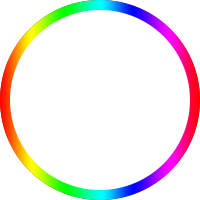 circle[/caption]
진행률이 0일 때는 회색 트랙을 표시하고, 로딩 과정에서 유색 바가 시계 방향으로 한 바퀴를 채웁니다.
2. 고전적인 해법 "두 개의 문"
원형 프로그레스 바에는 고전적인 해법이 하나 있는데, 그 원리가 매우 흥미롭습니다. HTML 구조는 다음과 같습니다:
<div class="circle progress-basic">
    <div class="left">
        <div class="circle left-circle"></div>
    </div>
    <div class="right">
        <div class=" circle right-circle"></div>
    </div>
</div>
우선 원은 생각하지 말고, 양쪽으로 열리는 문을 상상해 보세요. progress-basic은 문틀이고, left는 왼쪽 문, right는 오른쪽 문입니다:
.progress-basic {
    position: relative;
}
.left, .right {
    position: absolute;
    width: 100px; height: 200px;
    top: 0;
    overflow: hidden;
}
.left {
    left: 0;
}
.right {
    right: 0;
}
이제 0-180deg 효과를 어떻게 구현할지 고민해 봅시다. 프로그레스 바는 12시 방향부터 조금씩 나타나 오른쪽 반원을 채워야 합니다. 180deg가 되었을 때 왼쪽 반원은 회색 트랙이고 오른쪽 반원은 프로그레스 바가 됩니다.
상상해 보세요. 정사각형 종이의 왼쪽에 반원을 그렸습니다. 왼손으로 왼쪽을 가린 상태에서 종이를 시계 방향으로 회전시키면, 반원이 왼손가락 끝에서부터 조금씩 나타납니다. 180도 회전했을 때 정확히 왼쪽은 빈 공간이고 오른쪽은 반원이 됩니다. 이때 더 회전하면 안 됩니다. 정체가 탄로나기 때문이죠 (반원 프로그레스 바가 딱 맞춰 끝났는데 더 돌리면 끊어져 보입니다).
180-360deg 구간도 비슷합니다. 반원 프로그레스 바를 먼저 숨겨두고 조금씩 돌려서 나타나게 합니다. 전체 CSS는 다음과 같습니다:
.circle {
    width: 200px; height: 200px;
    box-sizing: border-box;
    border-radius: 50%;
    border: 10px solid silver;
}

.progress-basic {
    position: relative;
}
.left, .right {
    position: absolute;
    width: 100px; height: 200px;
    /* 부모의 border 안으로 밀어 넣음 */
    top: -10px;
    overflow: hidden;
}
.left {
    /* 부모의 border 안으로 밀어 넣음 */
    left: -10px;
}
.right {
    /* 부모의 border 안으로 밀어 넣음 */
    right: -10px;
}
.left-circle, .right-circle {
    border-color: #077df8;
}
.left-circle {
    margin-right: -100px;
    border-left-color: transparent;
    border-top-color: transparent;
    transform: rotateZ(-45deg);
}
.right-circle {
    margin-left: -100px;
    border-right-color: transparent;
    border-bottom-color: transparent;
    transform: rotateZ(-45deg);
}
문틀은 자체적으로 회색 트랙을 가지고 있고, 두 개의 문은 overflow: hidden 상태입니다. 왼쪽 문은 오른쪽 반원 바를 숨기고 있고, 오른쪽 문은 왼쪽 반원 바를 숨기고 있습니다. 먼저 오른쪽 종이를 돌려 종이 위의 왼쪽 반원이 나타나게 하고, 180도 이후에는 왼쪽 종이를 돌려 종이 위의 오른쪽 반원이 나타나게 합니다. 360도가 되면 정확히 완전한 원이 맞춰집니다. 다음과 같습니다:
var $ = document.querySelector.bind(document);

void function() {
    var $rightCircle = $('.right-circle');
    var $leftCircle = $('.left-circle');
    var prog = 0;
    var deg = 0;
    var initialDeg = -45;
    var halfDone;
    var timer = setInterval(function() {
        prog += 0.01;
        deg = 360 * prog;
        if (deg < 180) {
            $rightCircle.style.transform = 'rotateZ(' + (initialDeg + deg) + 'deg)';
        }
        else if (deg < 360) {
            if (!halfDone) {
                console.log('half done');
                $rightCircle.style.transform = 'rotateZ(' + (initialDeg + 180) + 'deg)';
                halfDone = true;
            }
            $leftCircle.style.transform = 'rotateZ(' + (initialDeg + deg - 180) + 'deg)';
        }
        else {
            console.log('done');
            $leftCircle.style.transform = 'rotateZ(' + (initialDeg + 180) + 'deg)';
            clearInterval(timer);
        }
    }, 100);
}();
매우 기발한 방법입니다. 정식 명칭이 있는지는 모르겠으나, 여기서는 임시로 "두 개의 문"이라고 부르겠습니다.
P.S. clip 속성을 통해서도 구현 가능하며 원리는 같습니다.
3. 고전적인 해법 시도해 보기
"두 개의 문" 원리는 범용적인 것 같아 이를 그라데이션 프로그레스 바에 그대로 적용해 보았습니다. 그러려면 프로그레스 바 이미지를 수평으로 뒤집은 뒤 좌우 두 개로 나누어야 합니다:
[caption id="attachment_1239" align="alignnone" width="404"]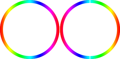 circle-left-right[/caption]
구체적인 코드는 다음과 같습니다:
<div class="circle circle-image progress-basic">
    <div class="left">
        <div class="circle left-circle"></div>
    </div>
    <div class="right">
        <div class=" circle right-circle"></div>
    </div>
</div>

/* 그라데이션 이미지를 좌우로 이어 붙임 */
.circle-image .left-circle {
    margin-right: -100px;
    border: none;
    background: url(circle-right.png) no-repeat 100px 0;
    -webkit-background-size: 100px 200px;
    background-size: 100px 200px;
    transform: rotateZ(0deg);
}
.circle-image .right-circle {
    margin-left: -100px;
    border: none;
    background: url(circle-left.png) no-repeat 0 0;
    -webkit-background-size: 100px 200px;
    background-size: 100px 200px;
    transform: rotateZ(0deg);
}
그런데 한 가지 치명적인 문제가 있습니다. 180도 시점에 반대쪽이 매끄럽게 이어지지 않습니다. 단색인 경우에는 좌우 반원의 색상이 같아 180-360deg 사이의 차이가 보이지 않아 문제가 없지만, 그라데이션 원형은 180도 이후 왼쪽 원형이 조금씩 나타나는 게 아니라 통째로 회전하며 나타나는 것이 확연히 보입니다. 이 시도는 실패했고 다른 방식을 고민해 봅니다.
4. 흰색 블록 마스크
전혀 다른 접근 방식은 프로그레스 바 원형을 미리 밑에 깔아두고, 좌우를 흰색 블록으로 가린 다음, 오른쪽 흰색 블록을 시계 방향으로 회전시켜 밑에 있는 오른쪽 반원을 조금씩 드러내는 것입니다. 180도부터는 왼쪽 흰색 블록을 회전시켜 왼쪽 반원을 드러냅니다.
이렇게 하면 원형 자체가 이미 완성된 상태이므로 좌우가 어긋나는 문제가 발생하지 않습니다. 바 문제는 해결했으니 이제 트랙 문제를 생각해야 하는데, 트랙을 좌우 흰색 블록 위에 그려두면 블록이 회전함에 따라 트랙도 같이 회전하면서 프로그레스 바가 조금씩 나타나게 됩니다. 완벽합니다. 코드는 다음과 같습니다:
<div class="circle circle-block progress-basic">
    <div class="left">
        <div class="block left-block">
            <div class="circle"></div>
        </div>
    </div>
    <div class="right">
        <div class="block right-block">
            <div class="circle"></div>
        </div>
    </div>
    <div class="circleBar"></div>
</div>

/* 흰색 블록으로 가림 */
.circle-block .block {
    width: 100%; height: 100%;
    background: #fff;
}
.circle-block .right-block {
    -webkit-transform-origin: 0 50%;
    /* 노출되는 가장자리를 덮음 */
    border-right: 1px solid #fff;
}
.right-block .circle {
    margin-left: -100px;
    border-left-color: transparent;
    border-top-color: transparent;
    transform: rotateZ(-45deg);
}
.circle-block .left-block {
    -webkit-transform-origin: 100% 50%;
    /* 노출되는 가장자리를 덮음 */
    border-left: 1px solid #fff;
    margin-left: -1px;
}
.left-block .circle {
    border-right-color: transparent;
    border-bottom-color: transparent;
    transform: rotateZ(-45deg);
}
.circle-block .circleBar {
    width: 200px; height: 200px;
    margin-top: -10px; margin-left: -10px;
    background: url(circle.png) no-repeat 0 0;
    -webkit-background-size: 200px 200px;
    background-size: 200px 200px;
}
고해상도 기기에서는 흰색 블록이 완벽하게 가려지지 않을 수 있으므로 다음과 같은 처리가 필요합니다:
/* 노출되는 가장자리를 덮음 */
border-right: 1px solid #fff;
효과는 꽤 괜찮지만 명확한 한계가 있습니다. 단색 배경에서만 사용 가능하다는 점입니다. 흰색 블록의 배경색이 페이지 배경색과 일치해야 하기 때문이며, 그렇지 않으면 정체가 탄로 납니다.
5. Canvas 스트로크
여건이 된다면 Canvas로 그리는 것이 모든 문제를 한 번에 해결하는 가장 좋은 방법입니다:
<canvas class="canvas">Canvas를 지원하지 않는 브라우저입니다.</canvas>

void function() {
    var options = {
        size: 200,
        lineWidth: 10,
        rotate: 0
    };

    var canvas = $('.canvas');
    var ctx = canvas.getContext('2d');
    canvas.width = canvas.height = options.size;

    // 원점을 중심으로 재설정
    ctx.translate(options.size / 2, options.size / 2);
    // x축이 -y 방향과 겹치도록 -90도 회전
    ctx.rotate((-1 / 2 + options.rotate / 180) * Math.PI);

    var radius = (options.size - options.lineWidth) / 2;

    var drawCircle = function(color, lineWidth, percent) {
            percent = Math.min(Math.max(0, percent || 1), 1);
            ctx.beginPath();
            ctx.arc(0, 0, radius, 0, Math.PI * 2 * percent, false);
            ctx.strokeStyle = color;
            // butt, round 또는 square
            // 선 끝 모양
            // butt: 기본값, 장식 없음, 툭 끊긴 느낌
            // round: 선 끝을 반원으로 감싸기
            // square: 선 끝을 반듯한 사각형으로 감싸기 (butt와 비슷해 보이나 lineWidth만큼 더 김)
            ctx.lineCap = 'butt';
            ctx.lineWidth = lineWidth;
            ctx.stroke();
    };

    // 회색 트랙
    drawCircle('#efefef', options.lineWidth, 100 / 100);

    var prog = 0;
    // 그라데이션 색상 바
    var gradient = ctx.createLinearGradient(0, 100, 0, -100);
    gradient.addColorStop(0, '#ff0000');
    gradient.addColorStop(0.15, '#ff00ff');
    gradient.addColorStop(0.33, '#0000ff');
    gradient.addColorStop(0.49, '#00ffff');
    gradient.addColorStop(0.67, '#00ff00');
    gradient.addColorStop(0.84, '#ffff00');
    gradient.addColorStop(1, '#ff0000');
    // '#077df8'
    var timer = setInterval(function() {
        prog += 1;
        // 색상 바
        drawCircle(gradient, options.lineWidth, prog / 100);
        if (prog >= 360) {
            clearInterval(timer);
        }
    }, 100);
}();
그라데이션 정의 시 주의할 점은 다음과 같습니다:
var gradient = ctx.createLinearGradient(0, 100, 0, -100);
좌표계가 두 번 변환되었기 때문에 실제로는 오른쪽에서 왼쪽으로 가는 선형 그라데이션이 됩니다:
// 원점을 중심으로 재설정
// 원점을 (100, 100)으로 평행 이동
ctx.translate(options.size / 2, options.size / 2);
// x축이 -y 방향과 겹치도록 -90도 회전
// x축과 y축이 전치됨
ctx.rotate((-1 / 2 + options.rotate / 180) * Math.PI);
프로그레스 바 끝부분을 둥글게 만드는 것도 매우 쉽습니다:
ctx.lineCap = 'round';
// 선 끝 모양
// butt: 기본값, 장식 없음, 툭 끊긴 느낌
// round: 선 끝을 반원으로 감싸기
// square: 선 끝을 반듯한 사각형으로 감싸기 (butt와 비슷해 보이나 lineWidth만큼 더 김)
하지만 Canvas 스트로크는 고해상도 기기에서 *계단 현상(Aliasing)*이 발생할 수 있으므로 약간의 팁이 필요합니다:
var width = canvas.width, height=canvas.height;
if (window.devicePixelRatio) {
    canvas.style.width = width + "px";
    canvas.style.height = height + "px";
    canvas.height = height * window.devicePixelRatio;
    canvas.width = width * window.devicePixelRatio;
    ctx.scale(window.devicePixelRatio, window.devicePixelRatio);
}
화면 배율에 맞춰 캔버스 크기를 키우면 계단 현상을 해결할 수 있습니다.
6. SVG 패스 애니메이션
마찬가지로 조건이 된다면 SVG 패스(Path) 애니메이션으로도 구현할 수 있습니다:
<div class="progress-svg">
    <!-- 바 -->
    <svg viewBox="-10 -10 220 220">
    <g fill="none" stroke-width="10" transform="translate(100,100)">
    <path d="M 0,-100 A 100,100 0 0,1 86.6,-50" stroke="url(#cl1)"/>
    <path d="M 86.6,-50 A 100,100 0 0,1 86.6,50" stroke="url(#cl2)"/>
    <path d="M 86.6,50 A 100,100 0 0,1 0,100" stroke="url(#cl3)"/>
    <path d="M 0,100 A 100,100 0 0,1 -86.6,50" stroke="url(#cl4)"/>
    <path d="M -86.6,50 A 100,100 0 0,1 -86.6,-50" stroke="url(#cl5)"/>
    <path d="M -86.6,-50 A 100,100 0 0,1 0,-100" stroke="url(#cl6)"/>
    </g>
    </svg>
    <!-- 트랙 -->
    <svg viewBox="-10 -10 220 220">
    <path d="M200,100 C200,44.771525 155.228475,0 100,0 C44.771525,0 0,44.771525 0,100 C0,155.228475 44.771525,200 100,200 C155.228475,200 200,155.228475 200,100 Z" stroke-dashoffset="629"></path>
    </svg>
</div>
<!--  Defining Angle Gradient Colors  -->
<svg width="0" height="0">
<defs>
<linearGradient id="cl1" gradientUnits="objectBoundingBox" x1="0" y1="0" x2="1" y2="1">
    <stop stop-color="#618099"/>
    <stop offset="100%" stop-color="#8e6677"/>
</linearGradient>
<linearGradient id="cl2" gradientUnits="objectBoundingBox" x1="0" y1="0" x2="0" y2="1">
    <stop stop-color="#8e6677"/>
    <stop offset="100%" stop-color="#9b5e67"/>
</linearGradient>
<linearGradient id="cl3" gradientUnits="objectBoundingBox" x1="1" y1="0" x2="0" y2="1">
    <stop stop-color="#9b5e67"/>
    <stop offset="100%" stop-color="#9c787a"/>
</linearGradient>
<linearGradient id="cl4" gradientUnits="objectBoundingBox" x1="1" y1="1" x2="0" y2="0">
    <stop stop-color="#9c787a"/>
    <stop offset="100%" stop-color="#817a94"/>
</linearGradient>
<linearGradient id="cl5" gradientUnits="objectBoundingBox" x1="0" y1="1" x2="0" y2="0">
    <stop stop-color="#817a94"/>
    <stop offset="100%" stop-color="#498a98"/>
</linearGradient>
<linearGradient id="cl6" gradientUnits="objectBoundingBox" x1="0" y1="1" x2="1" y2="0">
    <stop stop-color="#498a98"/>
    <stop offset="100%" stop-color="#618099"/>
</linearGradient>
</defs>
</svg>
대응하는 CSS는 다음과 같습니다:
.progress-svg {
  display: inline-block;
  position: relative;
  text-align: center;
}
.progress-svg svg {
  width: 200px; height: 200px;
}
.progress-svg svg:nth-child(2) {
  position: absolute;
  left: 0;
  top: 0;
  -webkit-transform: rotate(-90deg);
          transform: rotate(-90deg);
}
.progress-svg svg:nth-child(2) path {
  fill: none;
  stroke-width: 25;
  stroke-dasharray: 629;
  stroke: #fff;
  opacity: .9;
  -webkit-animation: load 10s;
          animation: load 10s;
}
@keyframes load {
  0% {
    stroke-dashoffset: 0;
  }
}
SVG 패스 애니메이션은 패스의 두 가지 속성과 관련이 있습니다:
-
stroke-dasharray: 대시(점선)의 길이
-
stroke-dashoffset: 대시의 시작 위치 오프셋 (왼쪽으로 오프셋)
왼쪽으로 오프셋된다는 점이 핵심입니다. 이를 이해해야 왜 0으로 줄어들어야 하는지(0에서 늘어나는 게 아니라) 알 수 있습니다:
A dashed stroke with a non-zero dash offset. The dashing pattern is 20,10 and the dash offset is 15. The red line shows the actual path that is stroked.
[caption id="attachment_1240" align="alignnone" width="307"]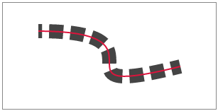 stroke-dashoffset[/caption]
자세한 내용은 SVG 명세를 참조하세요.
원리는 stroke-dasharray의 길이를 path보다 길게 설정하고, stroke-dashoffset을 stroke-dasharray와 같게 만드는 것입니다. 이때는 아무것도 그려지지 않습니다(왼쪽 오프셋 때문에 점선의 첫 번째 실선 구간이 사라짐). 그런 다음 오프셋을 0까지 줄여나가면 시각적으로 점선의 첫 번째 실선 구간이 왼쪽에서부터 조금씩 나타나게 되며, 0이 되었을 때 정확히 path를 다 덮게 됩니다.
반대로 stroke-dashoffset을 0으로 두고 stroke-dasharray를 0부터 path 길이까지 늘린다면, 첫 번째 실선 구간이 조금씩 길어지기는 하겠지만 이어지는 다음 구간들을 숨길 방법이 없기 때문에 스트로크 애니메이션을 구현하는 데 사용할 수 없습니다.
하지만 SVG 그라데이션 스트로크에는 이음새 문제가 있습니다. 자세히 보면 원형 위에 4개의 끊어진 부분이 보이는데, 두 그라데이션이 매끄럽게 이어지지 않기 때문입니다. 그라데이션 색상 값을 완벽하게 정의했더라도 실제 렌더링 결과는 이상적이지 않습니다.
마찬가지로 CSS로 그라데이션 테두리를 만드는 것도 좌우 이음새 문제가 발생합니다:
<div class="colorfulBorder"></div>

.colorfulBorder {
    width:100px; height:100px; -webkit-transform:rotate(90deg);
}
.colorfulBorder:before {
    content:"";
    display:block;
    width:100px; height:50px;
    margin-top:10px; padding:10px; padding-bottom:0; box-sizing:border-box;
    border-top-left-radius:50px;
    border-top-right-radius:50px;
    background:-webkit-gradient(
        linear,
        left top,
        right top,
        color-stop(0,#fff),
        color-stop(1,#fff)
    ),-webkit-gradient(
        linear,
        left top,
        right top,
        color-stop(0,#077df8),
        color-stop(1,#74baff)
    );
    background-clip:content-box,padding-box;
}
.colorfulBorder:after {
    content:"";
    display:block;
    width:100px; height:50px;
    padding:10px; padding-top:0;
    box-sizing:border-box;
    border-bottom-left-radius:50px;
    border-bottom-right-radius:50px;
    background:-webkit-gradient(
        linear,
        left top,
        right top,
        color-stop(0,#fff),
        color-stop(1,#fff)
    ),-webkit-gradient(
        linear,
        left top,
        right top,
        color-stop(0,#fff),
        color-stop(1,#74baff)
    );
    background-clip:content-box,padding-box;
}
이러한 결함 때문에 이 방안은 실무에 적용하기 어렵습니다.
7. 온라인 데모
데모 주소: http://www.ayqy.net/temp/progress/circle.html
8. 요약
단색 원형 프로그레스 바의 경우 고전적인 "두 개의 문" 해법을 권장하며, 이는 단색이 아닌 배경에도 잘 적응합니다.
그라데이션 원형 프로그레스 바의 경우 다음과 같이 선택하세요:
-
여건이 된다면 비단색 배경에도 적합한 Canvas를 최우선으로 사용하세요.
-
그렇지 않다면 흰색 블록 마스크 방식을 사용하되, 이는 단색 배경에서만 가능함을 유의하세요.
SVG 패스 애니메이션은 굽이치는 작은 강물과 같이 사용자 정의 모양의 프로그레스 바를 구현할 수 있으나, 그라데이션 스트로크의 경우 이음새가 생길 수 있습니다.
CSS 다중 background를 이용한 그라데이션 테두리 구현은 이음새가 너무 명확하여 권장하지 않습니다.
아직 댓글이 없습니다